DEPAUL HCI | A2B Transit App
Summary
We took on an ambitious challenge: how to provide every piece of transit information a user needs in a single app. We surveyed and interviewed users, and created an Axure prototype to run usability tests. We ultimately came away understanding that the power of the app would come not from allowing users to rank their preferred routes or transportation types, but having the app learn these user behaviors over time.
The Problem
To get a full picture of one's travel (public transit, ride sharing, etc.) options, a user needs to switch back and forth between multiple apps.
The Goal
Create a mobile transit app that combined the best features and functionality currently available on the market.
Scope/Timeline
10 weeks
Team
Two Depaul HCI graduate students in the final capstone course
Responsibilities
Run a competitive analysis
Write interview questions
Interview three participants on transit habits/routines and app usage
Write survey questions
Survey 114 participants on transit habits/routines and app usage
Sketch initial designs
Create wireframes and prototype with Axure
Create usability test script
Run usability tests with two participants
Write/edit final report
Create wireframes and prototype with Adobe XD
Interview Quotes
“The 56 [bus] is totally irrelevant to me as a user right now. So them showing me is just cluttering up the app for me. It’s giving me way more information than I need to know.”
“For trains especially - during rush hour - there’s very limited communication about delays or anything like that unless you’re present.”
Iterations
Below are some early annotated wireframe sketches that convey the main differentiating features of the app.


Final Design
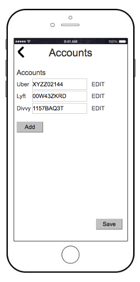
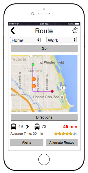
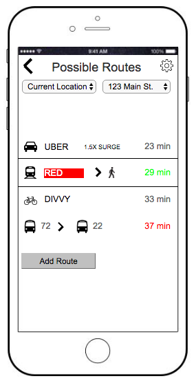
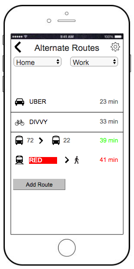
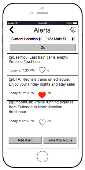
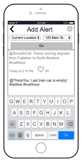
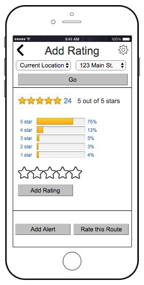
We created the final designs in Axure, focusing on self-selected user preferences to drive the app and a social aspect of rating/commenting on routes/commute circumstances to push user engagement:
I later came back with Adobe XD to design some screens:


